Basically, I’ll use the code from the article, Simple Bayesian modeling by Stan.
import pandas as pd
import pystan

cars = pd.read_csv('cars.csv')
data = {'X':cars['speed'], 'Y':cars['dist'], 'N':cars.shape[0]}
fit = pystan.stan(file='cars_generated.stan', data=data, seed=42)
data{
    int N;
    real X[N];
    real Y[N];
}

parameters{
    real a;
    real b;
    real<lower=0> sigma;
}

model {
    for (i in 1:N){
        Y[i] ~ normal(a * X[i] + b, sigma);
    }
}
generated quantities{
    real y_pred[N];
    for (i in 1:N){
        y_pred[i] = normal_rng(a * X[i] + b, sigma);
    }
}
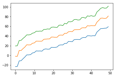
To get percentile points from the extracted sample points, we can use numpy’s percentile() function. The code below is to extract samples, to get percentile points and to visualize it.
import numpy as np
import matplotlib.pyplot as plt

samples = np.percentile(fit.extract(permuted=True)['y_pred'], q=[10, 50, 90], axis=0)

plt.plot(range(samples.shape[1]), samples[0])
plt.plot(range(samples.shape[1]), samples[1])
plt.plot(range(samples.shape[1]), samples[2])
In this case, the plot is showing 10%, 50% and 90% lines.