Overview
Before, I made the simple local level model to time series data. At that article, I just showed the sampled points traced the data. This time, I also do sampling to predict the following points of the data.
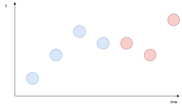
Roughly, on the image above, the blue points are data you already have and the red points are the predict target. The purpose of this article is to make model by blue points, data and predict red points, the values of future.
Data
I'll use the simple artificial data.import numpy as np
# make data
np.random.seed(59)
data = []
start_point = 10.0
data.append(start_point)
for i in range(100):
if i == 0:
temp = start_point
else:
next_temp = temp + np.random.normal(0, 1)
data.append(next_temp)
temp = next_tempBy visualizing, we can check the data behavior.
import matplotlib.pyplot as plt
plt.plot(list(range(len(data))), data)
plt.show()
Stan Modeling
The model itself is the same as the one I used on the article below.
Local level model to time series data on Stan
On the articles below, I tried local level modeling to time series data on Edward and am still struggling. Deep learning and Machine learning methods blog On the article below, I tried to analyze time series data with local level model. On Stan, I could do it before without problem.
Mathematically, the model can be expressed as below. This is simple local level model.
data {
    int N;
    int pred_Num;
    vector[N] X;
}

parameters {
    vector[N] u;
    real<lower=0> s_u;
    real<lower=0> s_x;
}

model {
    u[2:N] ~ normal(u[1:(N-1)], s_u);
    X ~ normal(u, s_x);
}

generated quantities {
    vector[N + pred_Num] u_pred;
    vector[pred_Num] x_pred;
    u_pred[1:N] = u;
    for (i in 1:pred_Num) {
        u_pred[N+i] = normal_rng(u_pred[N+i-1], s_u);
        x_pred[i] = normal_rng(u_pred[N+i], s_x);
    }
}
This time, I added generated quantities block. On this block, we can generate random numbers with the obtained parameters.
Execute
On Python, we can execute.import pystan
data_feed = {'X': data, 'N': len(data), 'pred_Num': 100}
fit = pystan.stan(file='generated_quantities.stan', data=data_feed, iter=1000)Check the outcome
By the extract() method, we can get the sampled points. Here, although in practical situation, it is better to use x_pred, I extracted the points of ‘u_pred’ and preserved the mean of those to the variable u_mean.samples = fit.extract(permuted=True)
u_mean = samples['u_pred'].mean(axis=0)plt.plot(list(range(len(data))), data)
plt.plot(list(range(len(u_mean))), u_mean)
plt.show()
You may feel strange about the image because future prediction points don’t change much. But it is natural. Because this plot just shows the mean points of sampled points, the points are kept in narrow area. If I plot sampled points one by one, it becomes like this.
u_pred_1 = samples['u_pred'][0][100:]
u_pred_2 = samples['u_pred'][1][100:]
u_pred_3 = samples['u_pred'][2][100:]
u_pred_4 = samples['u_pred'][3][100:]

plt.plot(list(range(len(data))), data)
plt.plot(list(range(len(u_mean))), u_mean)
plt.plot(list(range(100, 200)), u_pred_1)
plt.plot(list(range(100, 200)), u_pred_2)
plt.plot(list(range(100, 200)), u_pred_3)
plt.plot(list(range(100, 200)), u_pred_4)
plt.show()
As you can see, there are many patterns of moving.