Overview
On this article, I'll try anti-pattern of the local level model with explanatory variable.Before, on the article, Local level model with explanatory variable to time series data on Stan , I made the local level model with explanatory variable to time series data. From the article, I set the model as followings.
There, I set state disturbances as zero. That’s because on the book, An Introduction to State Space Time Series Analysis (Practical Econometrics)
Data
Before, I made the data with fixed slope . This time, I'll make the changeable.import numpy as np
# make data
np.random.seed(59)
x = np.random.normal(100, 5, 100)
data = []
u = []
u_start = 500.0
beta_start = 10.0
data.append(u_start + beta_start * x[0] + np.random.normal(0, 2))
u.append(u_start)
for i in range(100):
if i == 0:
u_temp = u_start
beta_temp = beta_start
else:
next_u = u_temp + np.random.normal(0, 2)
next_beta = beta_temp + np.random.normal(0, 5)
data.append(next_u + next_beta * x[i] + np.random.normal(0, 2))
u.append(next_u)
u_temp = next_u
beta_temp = next_beta
import matplotlib.pyplot as plt
plt.plot(list(range(len(data))), data)

plt.show()
Stan Modeling
can change, depending on .data {
int N;
vector[N] X;
vector[N] Y;
}
parameters {
vector[N] u;
vector[N] beta;
real<lower=0> s_y;
real<lower=0> s_u;
real<lower=0> s_b;
}
transformed parameters {
vector[N] y_hat;
for(i in 1:N){
y_hat[i] = u[i] + beta[i] * X[i];
}
}
model {
u[2:N] ~ normal(u[1:(N-1)], s_u);
beta[2:N] ~ normal(beta[1:(N-1)], s_b);
Y ~ normal(y_hat, s_y);
}Execute on Python
On Python, we can execute sampling and check the outcome.import pystan
data_feed = {'N': len(data), 'X': x, 'Y': data}
fit = pystan.stan(file='local_level_unstable.stan', data=data_feed, iter=1000)
samples = fit.extract(permuted=True)
beta_mean = samples['beta'].mean()
u_mean = samples['u'].mean(axis=0)
data_pred = u + beta_mean * x
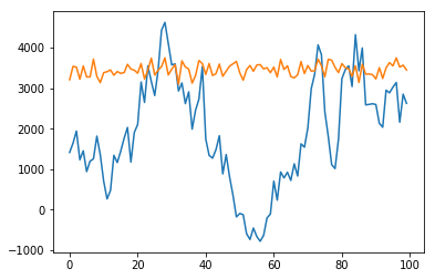
plt.plot(list(range(len(data))), data)
plt.plot(list(range(len(data))), data_pred)
plt.show()
As you can see, the sampled points doesn't trace the data well.