Overview
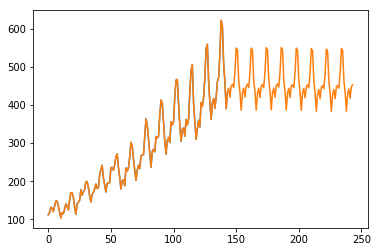
On time-series analytics, we frequently need to think about a recurring pattern. In the context of time-series analytics, a recurring pattern is referred to as a seasonal effect.For example, please see the image below. This image is the plotting of a time series data. As you can see, it has recurrent pattern.

On this article, I'll make the local level model with seasonal effects on Stan.
Data
I'll use an air passenger data, which is typical time series data. You can download this from the link below.On this article, to make the point clean-cut, I don't download the data on the code.
Anyway, import the necessary libraries and load the data.
import pandas as pd
import matplotlib.pyplot as plt
import statsmodels.api as sm
import pystan

data_loc = '/workspace/AirPassengers.csv'
data = pd.read_csv(data_loc)

print(data.head())
Month #Passengers
0 1949-01 112
1 1949-02 118
2 1949-03 132
3 1949-04 129
4 1949-05 121This data is very simple. The first columns means time and the second one is the amount of the passengers. From this point, I'll use just #Passengers column.
By visualizing this, we can check the behavior of the data.
ts_data = data['#Passengers']
plt.plot(ts_data)
plt.show()
Roughly, we can see the recurrent pattern. To make it clear, let’s visualize the autocorrelation. About the visualization of the autocorrelation, please check the article, How to check autocorrelation on Python.
import statsmodels.api as sm

sm.graphics.tsa.plot_pacf(ts_data, lags=40)
We can see that the periodicity is more or less twelve days.
Stan Model
We can express local model with seasonal effects as followings.
On this data, I'll assign eleven on . The Stan code becomes the followings.
data {
    int N;
    int pred_N;
    vector[N] y;
}

parameters {
    vector[N] s;
    vector[N] u;
    real<lower=0> s_s;
    real<lower=0> s_u;
    real<lower=0> s_y;
}

model {
    s[12:N] ~ normal(-s[1:N-11]-s[2:N-10]-s[3:N-9]-s[4:N-8]-s[5:N-7]-s[6:N-6]-s[7:N-5]-s[8:N-4]-s[9:N-3]-s[10:N-2]-s[11:N-1], s_s);
    u[2:N] ~ normal(u[1:N-1], s_u);
    y ~ normal(u+s, s_y);
}

generated quantities {
    vector[N+pred_N] s_pred;
    vector[N+pred_N] u_pred;
    vector[N+pred_N] y_pred;

    s_pred[1:N] = s;
    u_pred[1:N] = u;
    y_pred[1:N] = y;

    for (t in (N+1):(N+pred_N)){
        s_pred[t] = normal_rng(-s_pred[t-11]-s_pred[t-10]-s_pred[t-9]-s_pred[t-8]-s_pred[t-7]-s_pred[t-6]-s_pred[t-5]-s_pred[t-4]-s_pred[t-3]-s_pred[t-2]-s_pred[t-1], s_s);
        u_pred[t] = normal_rng(u_pred[t-1], s_u);
        y_pred[t] = normal_rng(u_pred[t]+s_pred[t], s_y);
    }
}
Execute
On Python, we can execute sampling and check the outcome.
data_feed = {'N': data.shape[0], 'pred_N': 100, 'y': ts_data}
season_fit = pystan.stan('seasonal_term.stan', data=data_feed, iter=1000)
By visualizing the sampled points, we can see that the points fluctuate by responding season.
samples = season_fit.extract(permuted=True)
y_pred = samples['y_pred'].mean(axis=0)

plt.plot(list(range(ts_data.shape[0])), ts_data)
plt.plot(list(range(len(y_pred))), y_pred)
plt.show()
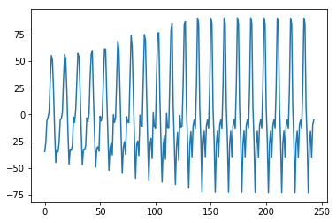
Of course, we can check the seasonal effects.
s_pred = samples['s_pred'].mean(axis=0)
plt.plot(list(range(0, s_pred.shape[0])), s_pred)
plt.show()